Paint Squash
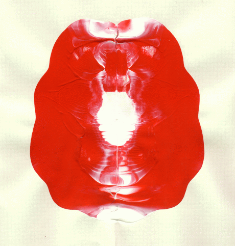
I tried this own experiementation at home. I got some paper, and I tried squishing out paint from the tube, then pressing it and unfolding. It’s a load of fun.
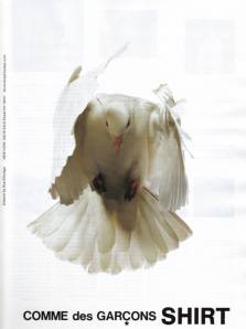
I am obsessed about this brand and their designer Rei Kawakubo. Comme des Garcons is a fashion brand that break rules in garment construction for men and women.
What strikes me most about her work is her advertisements. Kawakubo uses suggestion. This is something I want to learn from studying her works. Abstract images encourage one to figure out what’s going on; just like her clothes.

Fashion ads don't have to be all photoshoped models to define beauty.I love how the image suggests a spirit, or idea about the design.

I love how her images try to capture an abstract idea or feeling about a collection.

one of my final ideas for the poster
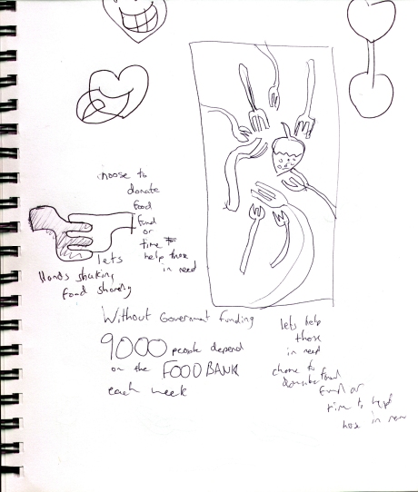
I was finding it challenging to represent hunger as an image. I keep thinking hearts and stomaches, or spoons shaped as hearts.

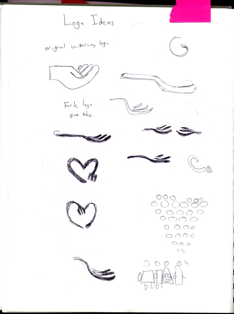
I was worried that the fork would look like a devil's pitch fork 😛

More logo decisions. Don't forks look like hands?

paper cut outs of forks
This image above is my cut outs of paper used to later be scanned. I learned about this technique when I studied Vittorio Fiorucci who designed the Le Chateau logo. His posters were all based on paper cut outs. It’s fun, and it makes for more organic approach to drawing.
Here is where I would imagine my poster being placed. It would be in a bustop ad, so that a community would be able to see it. Secondly, it would be placed in a grocery store.

Bus Stop

Grocery
My final attempt was to edit out the dish to one single piece of food that was recognizable, the carrot, and to remain true to the overall style of the illustration, cut that out of paper as well. I also changed the type face to Copper Black. It’s a typeface with more curves and helps unify the design a bit better. I also removed the heart logo and created a smaller one as well as added the food bank logo and website information. It was most challenging arranging the type. I also darkened the backdrop slightly, as the forks on the previous attempt was really faded.

final poster
In my second attempt I started fresh again. I thought, “what if there were a sea of forks waiting to chomp down on one dish of food. I begun by cutting with paper the forks. The overall image was a bit complex. Also, the “heart shaped” fork was my original logo and now it was being used as the visual. Selecting the type choice was also tricky. I originally chose Helevetica but I needed to rethink my placement of it.

idea 2
I decided on my next attempt that I would soften the contrast of the blue so that the message could still stand on it’s own. I also had to re-work the words I chose in the message, so that it looked cleaner on the page.

idea 3
My first visual I created was a whole bunch of food plates in the shape of a heart. I wanted to emphasize how important donating to the food bank meant for others. The image however spoke in opposition to my message. People are hungry, so food on plates didn’t quite fit. Furthermore, the warm colors didn’t pop out as much and that isn’t effective for a poster.

idea 1

